Crafting Prompts for Figma Make
In my last post, I talked about how I use Figma Make as a design tool, not a shortcut. This is about how I write prompts that produce useful output, how they evolve as the design evolves, and how small changes in framing can completely change what Figma Make gives you back.
For this example we will be testing prompts for designing a review screen where someone evaluates a submitted item. Think documents, requests, drafts—anything that needs feedback before it can move forward. There are multiple roles involved: someone who can approve or request changes, someone who can comment but not decide, and someone who can only view.
Before you run your prompt make sure to attached a design system; I’ll be using the Ant Design System. I’ve also set up my guidelines.md file to reflect that design system. It’s important to not forget this step if you plan to use an existing design system for your prompts.
-
## Figma Make Guidelines (Ant Design)
Use this file as the persistent ruleset for generating and editing designs in Figma Make with the Ant Design system.
Default behavior: be conservative. Preserve the current design unless changes are explicitly requested.
If something is unclear or under-specified, do not invent. Keep the UI stable and call out the ambiguity.
---
## 0) Operating Rules
- Use only the existing Ant Design components and patterns available in this Figma file.
- Do not introduce new visual styles, tokens, typography scales, or custom components.
- Do not redesign navigation, layout, or IA unless explicitly requested.
- Prefer small, reviewable changes over sweeping redesigns.
- When multiple valid options exist, choose the most standard Ant Design pattern.
---
## 1) Design System: Non-Negotiables
- Components must be Ant Design equivalents (Buttons, Inputs, Selects, Tables, Tabs, Modals, Drawers, Forms, etc.).
- Do not restyle components (no custom radius, shadows, icon sets, colors, type).
- Compose using standard patterns rather than creating “new” UI.
If a needed pattern does not exist in Ant Design, flag it and propose the closest standard alternative.
---
## 2) Layout & Spacing
- Use Ant Design layout patterns: grid-based structure, clear sections, predictable rhythm.
- Prioritize hierarchy and scanability over decorative layout.
- Keep spacing consistent across sections and within components.
- Avoid “clever” asymmetry unless explicitly asked.
Do not change global layout structure or navigation without an explicit instruction.
---
## 3) Typography
- Use Ant Design typography styles (`Title`, `Text`, `Paragraph`) as provided.
- No custom font sizes/weights/line heights.
- Headings represent hierarchy, not emphasis.
- Avoid giant hero type unless explicitly requested.
---
## 4) Color, Emphasis, and Restraint
- Use Ant Design tokens only.
- Color is for meaning: state, status, affordance. Not decoration.
- Prefer layout/hierarchy before using color for emphasis.
- Do not introduce new semantic meanings via color.
---
## 5) Actions & Interaction
- Make actions role-appropriate and state-dependent.
- One clear primary action per surface. Secondary actions do not compete.
- Destructive actions must be clearly labeled and use Ant Design destructive styling.
- Do not show actions that users cannot take.
Prefer hiding unavailable actions over disabling them, unless context is necessary.
---
## 6) Roles & Permissions
- If multiple roles exist, reflect differences explicitly in UI and available actions.
- Clearly distinguish read-only vs actionable states.
- Do not assume all users have the same permissions.
If role behavior is ambiguous, call it out instead of guessing.
---
## 7) States & Feedback
Account for:
- empty
- loading
- error
- success
- disabled
- read-only
Use Ant Design patterns (`Empty`, `Spin`, `Alert`, `Result`, inline validation).
Do not design only the happy path.
---
## 8) Forms
- Use Ant Design `Form` patterns for layout, labels, help text, and validation.
- Keep validation clear and local to the field.
- Avoid overloading one screen with too many fields without structure (sections, steps, or progressive disclosure).
- Maintain consistent label alignment and spacing.
---
## 9) Tables & Dense Data
- Use tables when users need to compare, scan, sort, filter, or manage lists.
- Prioritize readability: column alignment, clear headers, sensible truncation.
- Provide row-level actions consistently and avoid action clutter.
- Use tags/badges for state/status, not custom chips.
Do not “simplify” by removing needed columns or controls unless explicitly asked.
---
## 10) Modals, Drawers, and Secondary Flows
- Use `Modal` for short, focused tasks and confirmations.
- Use `Drawer` for side-panel detail/edit flows when context should remain visible.
- Do not bury primary tasks in modals.
Confirm destructive actions where appropriate.
---
## 11) Accessibility & Clarity
- Maintain sufficient contrast using existing tokens.
- Ensure focus states and keyboard navigability are preserved (don’t remove).
- Use clear labels. Avoid vague button text like “Submit” when context is unclear.
---
## 12) What NOT To Do
- Do not redesign the design system.
- Do not change typography scale or introduce new styles.
- Do not add animation unless asked.
- Do not add new features or workflow steps unless asked.
- Do not invent business logic, permissions, or states.
When in doubt: do less and ask for clarification.
---
## 13) Handling Ambiguity
If requirements are incomplete or unclear:
1. Keep the current UI stable.
2. Highlight what’s missing (roles, states, success criteria, constraints).
3. Offer the minimal set of questions needed to proceed.
Do not “fill in the gaps” with invented behavior.
---
## 14) Success Criteria
A design is successful if:
- It adheres to Ant Design patterns and components.
- Information hierarchy is clear and scannable.
- Roles, states, and actions are unambiguous.
- It can be implemented without reinterpretation.
- Changes are minimal, intentional, and reviewable.
Polish is secondary. Correctness and clarity come first.
-
Task
Design a review screen for a submitted item that requires evaluation before it can move forward.
Context
The screen is used to review items such as documents, requests, or drafts. The primary goal is to help users understand the item, understand its current state, and decide what to do next.
Roles & Permissions
Primary reviewer: can approve or request changes.
Secondary reviewers: can leave comments but cannot take approval actions.
View-only users: can see content and feedback but cannot interact.
Required Behavior
Clearly display the item content.
Clearly indicate the current review status.
Show all existing feedback in context.
Make available actions obvious and role-dependent.
Ensure users can easily tell what they can and cannot do.
Constraints
Use the existing Ant Design system only.
Do not introduce new components or redesign global navigation.
Focus on layout, hierarchy, and clarity rather than visual styling.
Success Criteria
The design should make it immediately clear:
what the item is,
what state it is in,
what feedback exists,
and what actions (if any) the current user can take.
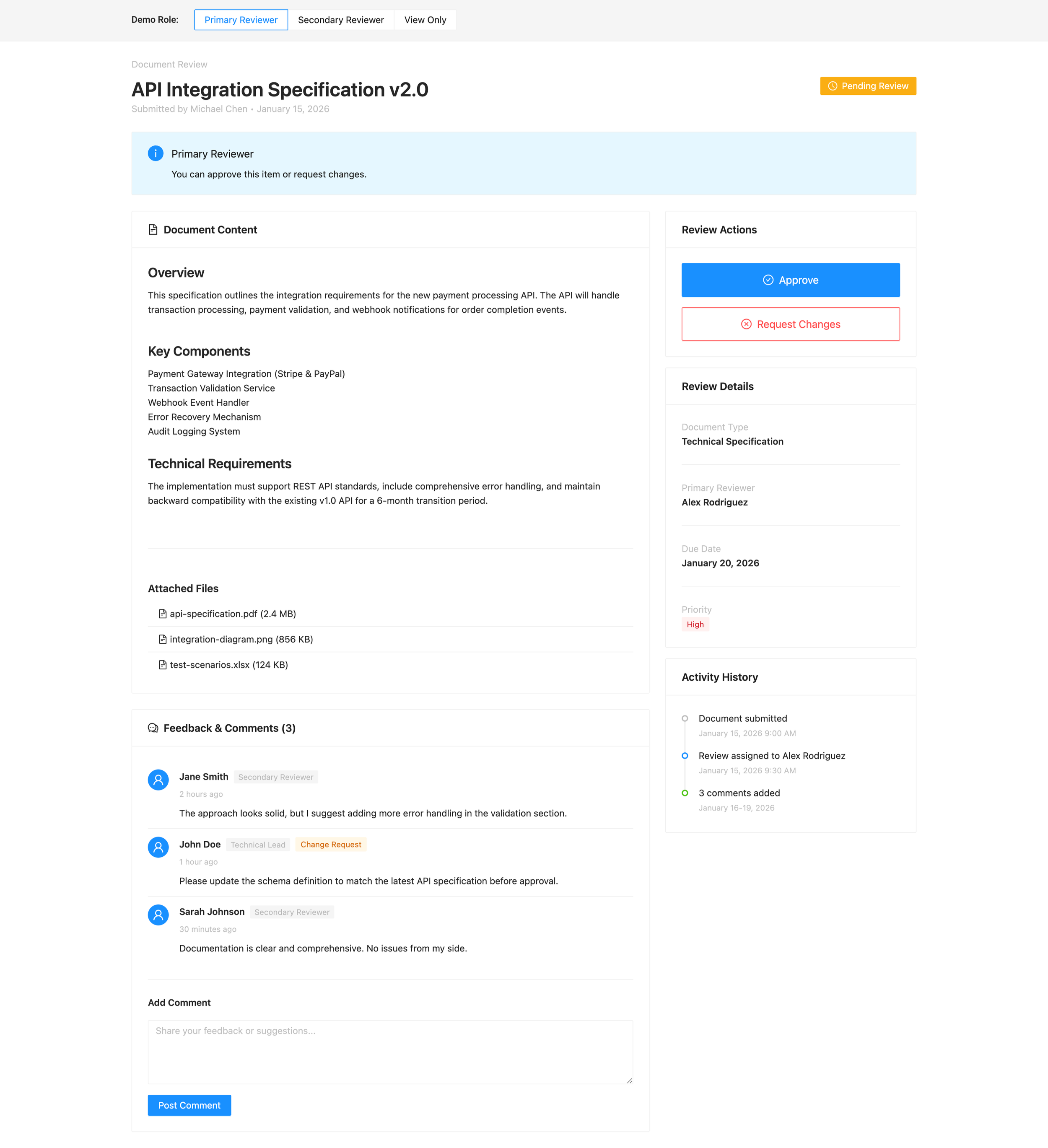
This is what the initial prompt produced and this is exactly what I want at this stage. The layout prioritizes structure over styling. Content is clearly separated from actions. Status is visible without competing for attention.
Feedback is grouped in a way that makes it obvious who said what and why it matters. Most importantly, the screen makes roles legible: as a primary reviewer, I can immediately see what I’m responsible for and what decisions I’m allowed to make.
The hierarchy is doing the work.
You’ll notice that actions are contained and intentional. Approval and request-changes live together, but they don’t overpower the content. Supporting details—review metadata, activity history, attachments—are present, but secondary. They’re accessible without pulling focus away from the task at hand.
This is the point of a good first pass with Figma Make. It’s not about shipping UI. It’s about validating that the shape of the solution makes sense before worrying about edge cases, refinements, or visual nuance.
What happens if we used a Bad Prompt instead?
Then we have the kind of prompt I see all the time:
Design a review screen where users can view a submitted item, leave comments, and approve or reject it. The screen should be easy to use and show all relevant information clearly.
It sounds reasonable. It’s also almost guaranteed to produce something vague. Who is “the user”? What decisions actually happen here? Are all users equal? What happens after approval or rejection? What state is the item currently in? None of that is defined, so Figma Make fills in the gaps on its own. The result might look polished, but it will be opinionated in ways you didn’t choose and hard to reason about later. This isn’t an AI problem. It’s a framing problem.
I’m still utilizing both the Ant Design system and the Guidelines.md file along with this prompt:
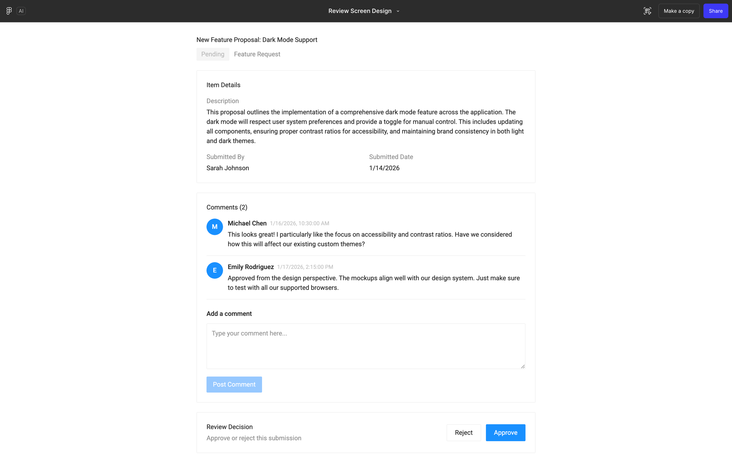
This is what happens when the prompt stays high-level and outcome-oriented.
This is what happens when the prompt stays high-level and outcome-oriented.
At first glance, the screen looks fine. Content is visible. Comments exist. Actions are present. But the moment you try to use it, the cracks show. Roles aren’t clearly differentiated, so actions feel generic rather than intentional. Approval controls appear without enough context, and it’s not immediately clear who is allowed to do what—or why.
The hierarchy reflects the prompt’s ambiguity. Because the instructions didn’t define states, permissions, or decision boundaries, the interface defaults to a one-size-fits-all layout. Everything is technically there, but nothing is prioritized.
This is the cost of an underspecified prompt. Figma Make filled in the gaps, but it did so by making assumptions you didn’t explicitly choose. The result is a UI that looks complete but is harder to reason about, harder to critique, and harder to evolve.
Tightening the Prompt as the Design Solidifies
As the design direction becomes clearer, let’s tighten the prompt further. This is where a lot of people stop, but this is also where the output actually starts to hold up. Let’s try:
Generate variants of the review screen for these states: pending, changes requested, approved, and read-only view-only. Each should use Ant Design patterns and respect role permissions.
Try it out for yourself or take a look at my result below:
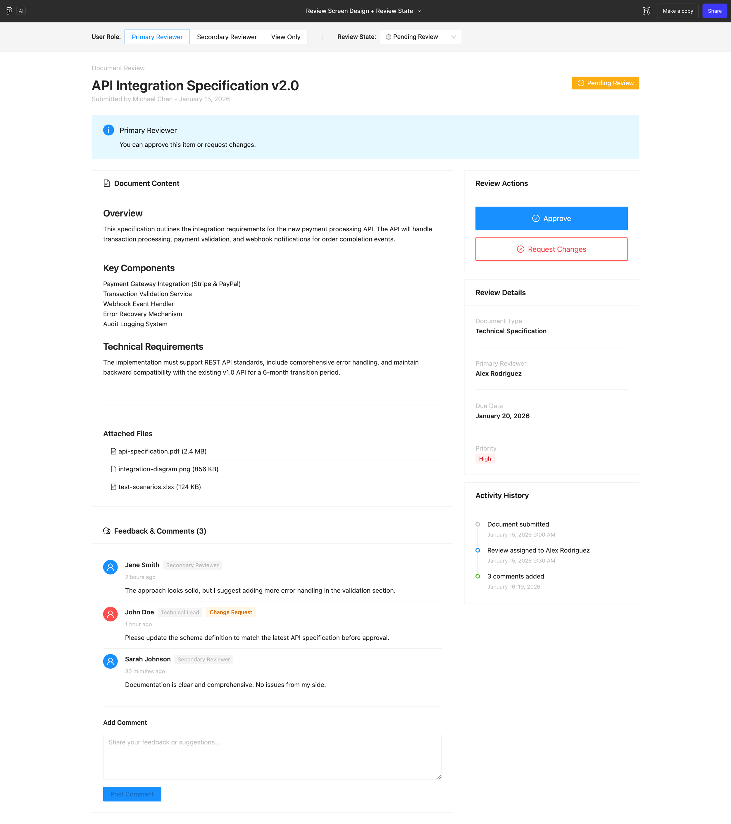
This is the same screen (from the 1st initial prompt), but now it understands state.
By asking Figma Make to generate variants for pending, changes requested, approved, and view-only states, the UI shifts from a static layout to a system that reflects how review actually works over time. Actions are no longer just present—they’re contextual. What I can do depends on both my role and where the item is in the process.
You can see how hierarchy adjusts subtly across states. Primary actions appear when a decision is required and recede when it’s not. Status indicators do real work instead of acting as labels. In view-only mode, the interface de-emphasizes decisions entirely and focuses on comprehension.
This is the point where the design stops being a screen and starts behaving like a workflow. Nothing new was added visually. The difference comes from making state explicit in the prompt.
If the earlier version answered what is this screen, this version answers when am I here and what can I do now.
Adding user roles
Right now the prompt describes roles in text only. Let’s see how UI changes by role with the following prompt:
For each screen state, render three role variations: approver (full actions), commenter (comment only), and viewer (read only). Show how action placement, affordances, and disabled/hidden actions differ by role.
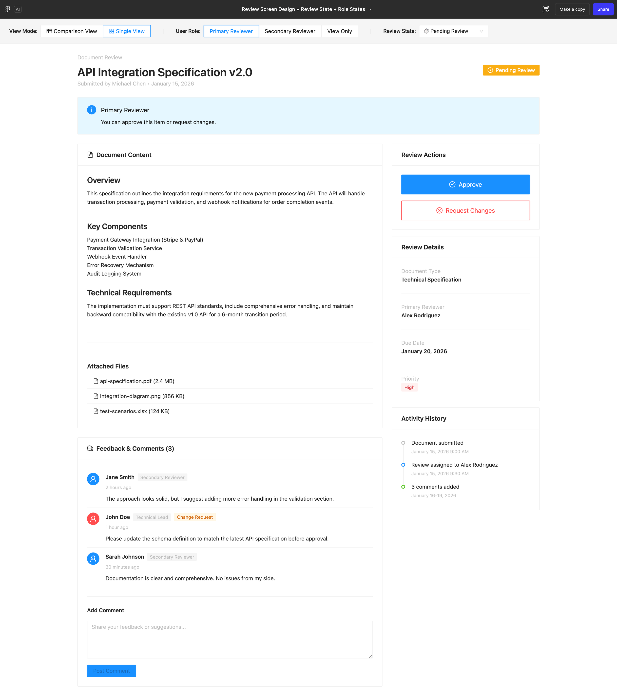
At this point, the screen understands not just state, but who the user is.
By rendering role-specific variations, approver, commenter, and viewer, the interface stops treating permissions as an invisible rule and starts making them legible in the UI. Actions appear, move, or disappear entirely based on what the user is allowed to do. Commenting remains accessible where it makes sense. Decision-making tools surface only when responsibility exists.
What’s important here is what didn’t change. The layout stays familiar. The content remains stable. What shifts is emphasis. For an approver, decisions are foregrounded. For a commenter, feedback becomes the primary interaction. For a viewer, the screen prioritizes understanding over action.
This is where prompts move beyond layout and into behavior. The design isn’t just reacting to data anymore, it’s responding to intent.
Where to stop (on purpose)
At this point, we could keep going. We could add more prompts to explore edge cases, compare layouts, or push into micro-interactions. Figma Make makes that kind of iteration fast and, that’s exactly the point.
But the real takeaway isn’t how far this specific prompted design can go. It’s how quickly the design started to behave once intent, state, and roles were made explicit in the prompt. That’s usually where I stop and shift modes—reviewing the file, polishing the concept, or moving into tools like Claude code to refine what’s now been validated.
From here, the most valuable work isn’t copying another prompt, it’s experimenting. Try stress-testing your own designs. Add a state you forgot. Remove an action and see what breaks.
This kind of exploration also works best when you’re starting from a designed frame in Figma, backed by a solid design system and, you want to explore ideas without resetting everything or starting from zero.
Just remember when prompts stop producing useful output, that’s usually the moment the design thinking itself needs another pass, not another prompt.